The Impact of Color Psychology on Workspace Productivity
Explore how color psychology in workspace influences productivity and mood. Learn to choose the best hues for an effective work environment.
26 min read
Nearly 70% of corporate clients that once chose neutral pods now ask for green or bold primary colors a shift that signals color is no longer decorative, but strategic.
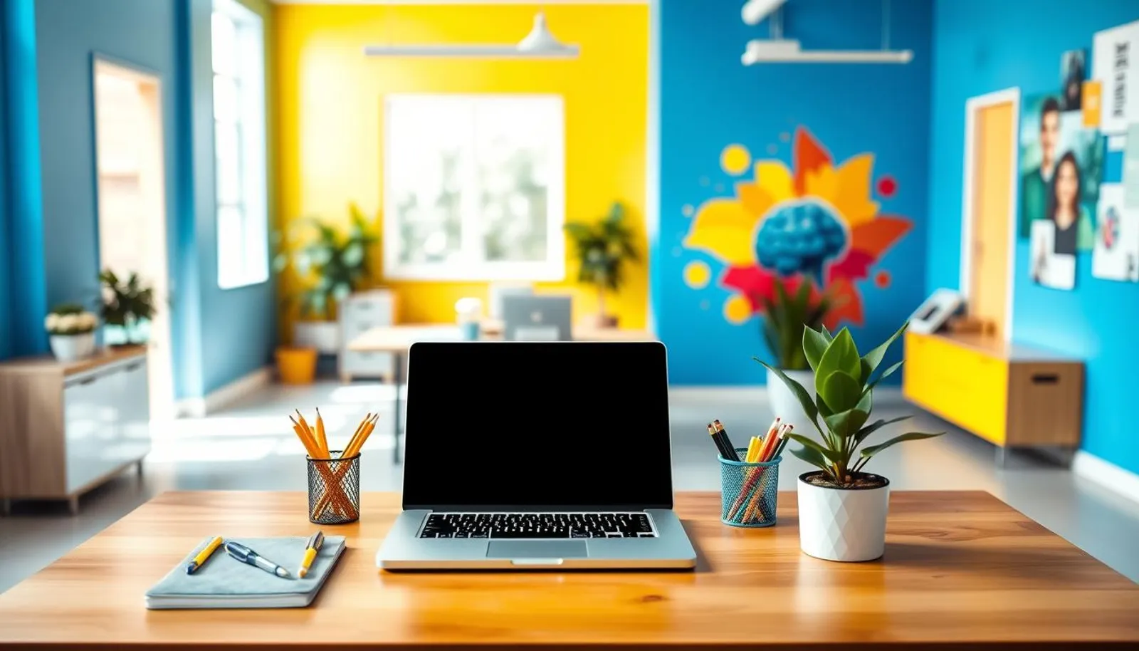
Employers and designers are treating color psychology in workspace planning as a tool to shape behavior and lift performance. Framery’s Lasse Karvinen highlights how deliberate palette choices help attract and retain talent, and companies such as Colliers in Frankfurt have added red, blue, and yellow pods to make offices more inviting and productive.
Research shows the impact of colors on work goes beyond mood: hues can change heart rate, alertness, and decision patterns. Thoughtful workspace color choiceslike blue or green for calm focus and vibrant accents for creativityreinforce brand identity while supporting wellbeing and efficiency.
Key Takeaways
- Color psychology in workspace is increasingly used to support employee efficiency and happiness.
- Green and blue tones often lower anxiety and sustain attention for focused tasks.
- Vibrant accents such as red and yellow can boost energy and creative thinking when used sparingly.
- Workspace color choices align with branding, recruitment, and retention goals.
- Designers, employers, and manufacturers must coordinate color intent to reach desired outcomes; see practical examples in this Forbes piece: how color psychology impacts today’s workplace.
Introduction to color psychology in workspace and productivity
Color shapes first impressions and day-to-day mood. Designers and leaders now treat color as a strategic choice rather than an afterthought. Thoughtful workspace color choices begin with intent and move into procurement and specification.
Why color choices matter in modern offices
Modern employers, from WeWork to Steelcase clients, use color to signal culture and attract talent. Bold tones can make a brand feel contemporary while neutrals suggest reliability. A company that specifies emerald Framery pods or lemon-yellow accents sends a different message than one that stays all-gray.
Overview of research linking color to mood, focus, and performance
Studies show blue and green reduce anxiety and eye fatigue, which supports longer focus. Warm hues, like yellow and red, can boost energy and spark creativity in short bursts. Research on how colors affect productivity ties these physiological responses to measurable changes in output and subjective wellbeing.
How employers use color to attract talent and shape culture
Progressive firms layer paint with materials, lighting, and furniture to create zones for specific tasks. Creative hubs get pops of red or yellow for ideation. Quiet zones favor blue or green for sustained attention. These workspace color choices help match environments to work modes and reinforce brand identity.
Practical step: test color in the real office before committing. A simple pilot, paired with employee feedback and basic productivity metrics, clarifies whether choices support work styles and recruitment goals.
Learn more about applied strategies and evidence-based tips at color psychology in the workplace.
How colors affect productivity: the science behind the effects
Designers and managers who study color psychology in workspace rely on lab tests and field surveys. These reveal links between hue, bodily response, and mental states. Understanding how colors affect productivity helps teams choose palettes that support focus, creativity, and wellbeing.
Physiological responses to color
Light in the blue spectrum can suppress melatonin and raise alertness. Offices lit with cooler, bluer tones mimic daytime cues and reduce sleepiness. Red tones, by contrast, tend to elevate heart rate and arousal, which can speed short, intense tasks.
Green and balanced neutrals lower eye strain when used near large monitors. That reduces fatigue over long shifts. Yellow and warm hues can raise skin conductance and make occupants feel more energetic during brainstorming sessions.
Psychological and cognitive impacts
Color shapes attention and creative thinking. Blue and green often support sustained focus and calm problem-solving. Warm accents such as orange or yellow nudge creative risk-taking and optimistic thinking.
Choice of color signals purpose. Quiet zones with cool tones cue deep work. Collaboration areas with brighter hues invite interaction. These cues guide behavior without signage, showing the practical impact of colors on work routines.
Summary of key studies demonstrating productivity changes
Multiple workplace surveys report measurable shifts in mood and output tied to color. Employees in blue or green settings reported roughly one-third less anxiety and a quarter less fatigue than those in gray or white rooms. Other field studies found offices using vibrant accents like orange and green gained about a 15 percent productivity uplift on specific tasks.
Design recommendations derive from these findings. Pair cool tones with tasks needing concentration. Use warm accents where bursts of energy or creativity are desired. Track results with simple metrics such as error rates, task completion times, and staff surveys to confirm the impact of colors on work.
| Color | Typical Physiological Effect | Psychological/Cognitive Outcome | Best Use in Office |
|---|---|---|---|
| --- | --- | --- | --- |
| Blue | Suppresses melatonin; raises alertness | Improves focus; reduces anxiety | Focused workstations, private offices |
| Green | Reduces eye strain; supports relaxation | Maintains sustained attention; comfort | Open-plan zones, healthcare-adjacent areas |
| Yellow | Increases arousal; can boost optimism | Stimulates creativity; risk of overstimulation | Brainstorm rooms, accent walls |
| Red | Elevates heart rate; heightens arousal | Enhances precision for short tasks; can stress | Proofreading stations, high-energy zones (as accent) |
| Neutral (Gray/White) | Minimal physiological change; can feel sterile | Supports professionalism; risks disengagement | Reception, brand-consistent backdrops with accents |
Blue ranks high in studies on color psychology in workspace because it soothes the nervous system and supports sustained attention. Designers at Framery and workplace teams at JLL recommend blue for rooms where clear thinking matters. Research links blue hues to lower anxiety and steady mental stamina during long tasks.
Calming effects and reduced anxiety
Light blue tends to create a peaceful mood that helps teams settle into focused work. Clinical and field studies show blue reduces stress markers, which supports longer attention spans and calmer meetings.
Blue light at certain temperatures can suppress melatonin, boosting alertness for tasks that require continuous attention. Use this effect thoughtfully to align with work schedules and avoid disrupting evening routines.
Choosing light versus dark blue for specific areas
Light blue works well in open areas and quiet corners where lowered arousal aids concentration. Dark blue signals authority and professionalism, so it fits client-facing spaces and rooms for decision-making.
Pair cool blues with natural textures or warm lighting to prevent a detached feel. This mix balances color psychology in workspace design with human comfort and helps demonstrate the impact of colors on work without overwhelming occupants.
Case examples: conference rooms and private offices
Colliers and other real estate firms use blue pods and private rooms to make spaces feel inviting while enhancing concentration. In conference rooms, dark blue walls can encourage clear, confident communication during negotiations.
Private offices with a blue focus cut cognitive load for analytical roles. Adding greenery or biophilic elements supports restoration and boosts memory by about 15 percent, showing how how colors affect productivity when combined with natural design.
For an evidence-based overview of the interplay between color and light on performance, see this executive summary on workplace design: psychology of colour and light.
Green and restorative design: reducing fatigue and boosting comfort
Green tones bring a quiet restfulness to work settings. Research links green to reduced eye strain and steady attention, which makes it a smart choice for areas where people spend long stretches on screens or review detailed documents.
Greens perceptual ease explains part of its power. The human eye processes mid-spectrum greens with low strain, so shared studios and deep-work zones often feel less tiring. Framery reports rising demand for emerald pods, a sign that workspace color choices now respond to both comfort and talent attraction.
The emerald and biophilic trend ties green to eco-conscious values and alertness. Karvinen links this popularity to employer branding that highlights sustainability. Using green accents or furniture sends a subtle message about culture while supporting the impact of colors on work by promoting calm focus.
Design guidance points to specific uses. Open-plan areas can benefit from muted greens to reduce visual fatigue. Collaborative zones gain energy from richer tones that still offer restorative effects. Healthcare-adjacent spaces use green for its proven soothing qualities and ability to help patients and staff feel steadier during long shifts.
An easy testing approach is to sample paint and textiles in the actual room. Small changes like green-backed screens, plant walls, or emerald meeting pods help teams experience how color psychology in workspace changes feel over a week. These low-risk experiments inform broader decisions about workspace color choices and the real impact of colors on work.
Yellow and creativity: energizing brainstorming spaces
Yellow can lift mood and spark new thinking when used with care. Progressive employers such as Framery choose lemon yellow pods to signal a modern, playful office and to shift room feel in ways that improve morale. Designers who study color psychology in workspace advise using softer yellows to promote optimism without overwhelming occupants.
How yellow encourages optimism and idea generation
Light yellow tones tend to boost feelings of warmth and openness. In innovation rooms, buttery yellow walls or accents can nudge teams toward imaginative thinking and freer brainstorming. Research on how colors affect productivity shows that yellow often pairs well with collaborative tasks that benefit from energy and positive affect.
Risks of overstimulation and tips to balance warm hues
Too-bright yellow may cause eye strain or anxiety for some people. To avoid that, limit intense yellow to smaller surfaces and pair it with calming neutrals. Use textured fabrics, soft lighting, and plants to temper visual intensity and support sustained sessions.
Practical uses: innovation rooms, accents, and small decor
Best practices favor light or buttery yellows on accent walls, seats, or movable pods rather than full-room saturation. Small decor itemspillows, lamps, markerboardsdeliver creative cues without dominating the space. For guidance rooted in practice and research, consult a short primer on the science of color at color psychology in workspace.
| Use Case | Recommended Yellow | Balance Strategy | Expected Effect |
|---|---|---|---|
| --- | --- | --- | --- |
| Brainstorming room | Buttery or lemon yellow accent wall | Pair with warm wood tones and pale gray | Increases idea flow and optimism |
| Phone booths and pods | Soft lemon on small surfaces | Neutral upholstery and indirect lighting | Signals playful, modern space without overstimulating |
| Open collaboration areas | Subtle yellow furnishings | Mix with greens or blues for focus | Balances creativity with concentration |
| Accessories and decor | Accent pillows, lamps, stationery | Use sparingly across neutral palette | Adds energy and visual interest |
Red and performance: urgency, precision, and careful use
Red demands attention. Design teams and behavioral researchers often cite red as a color that raises arousal and sharpens short-term focus. When used with care, it can enhance speed and accuracy on specific tasks without overtaking a space.

Reds physiological effects and benefits for detailed tasks
Exposure to red can increase heart rate and trigger a stronger sympathetic response. That boost can sharpen vigilance for brief, detail-oriented work such as proofreading or quality control. Framery clients have reported using red pods to add energy and variety to workspace palettes.
Where red helps and where to avoid it
Red works well in short-duration, high-energy zones and places that require quick, precise decisions. Proofreading rooms, short-focus booths, and some sales huddle spaces benefit from red accents. Avoid dominant red in areas meant for prolonged concentration or calm tasks, since extended exposure risks fatigue and overstimulation.
Design strategies for using red as an accent, not a dominant color
Keep red as a directional or accent color. Use it on trim, wayfinding signs, furniture pieces, or a single wall to create urgency without overwhelming. Pair red with cool neutrals or calming greens to balance intensity and control the impact of colors on work.
Designers should test red tones under actual lighting and in pilot zones before full application. This step helps predict how color psychology in workspace will play out in daily routines and how colors affect productivity across teams.
Neutral palettes and white: professionalism versus sterility
Neutral palettes remain a mainstay in corporate design. Historically, offices favored blacks, whites, and beiges to signal professionalism and ensure brand consistency. Those choices keep spaces adaptable for changing teams and furniture layouts while supporting broader workspace color choices.
Neutrals like warm gray, taupe, and beige offer flexibility when combined with brand elements. They create clean backdrops that make logos and product displays stand out. Smart use of neutrals reflects color psychology in workspace planning by calming visual noise and supporting focused tasks.
Too much stark white or heavy gray can feel sterile and drain energy. Long stretches of flat gray may increase feelings of fatigue or disengagement among staff. The impact of colors on work shows that mood and motivation shift when environments feel lifeless instead of lived-in.
Layering texture softens neutral schemes. Use wood, woven fabrics, and matte finishes to add depth. This approach enhances comfort and offsets the clinical edges that plain white walls can produce.
Lighting plays a major role in warming neutrals. High-CRI bulbs render tones accurately and preserve skin tones under office lighting. Warmer color temperatures in lounges and cooler tones near workstations help define function while supporting color psychology in workspace design.
Accent colors and natural elements reinvigorate neutral bases. Introduce color through seating, art, plants, and removable partitions to test combos before committing. Thoughtful accents demonstrate how the impact of colors on work can be positive when neutrals serve as a flexible canvas.
Combining colors strategically: color pairings that support tasks
Thoughtful color pairings shape behavior and make workspaces more effective. Practical combinations help teams shift between idea generation and focused execution. Designers, employers, and manufacturers often collaborate to test palettes that match each room’s purpose.
Mixing warm and cool tones to balance creativity and focus
Pair warm accents with cool backgrounds to keep energy high without sacrificing concentration. Warm hues spark optimism in meeting zones. Cool tones steady attention in individual desks. These choices reflect how colors affect productivity and help create predictable moods across an office.
Examples: blue + yellow for meetings, green + neutral for deep work
Blue paired with yellow encourages lively discussion while keeping focus intact. Use blue walls with yellow seating or artwork in collaboration rooms. Green with a neutral palette eases eye strain and supports longer periods of attention. Small accents let teams experience the impact of workspace color choices before a full repaint.
Using color zones to define room function and encourage desired behavior
Map functions to color zones so staff recognize intended uses at a glance. Creative rooms get brighter, varied palettes. Quiet zones adopt muted, restorative shades. Test accent walls and modular elements to refine decisions, then scale successful pairings across sites to align color psychology in workspace with company goals.
Lighting, color temperature, and their interaction with paint choices
Light shapes how we perceive color and how color shapes our mood at work. The impact of colors on work depends on shifting daylight, fixture temperature, and paint finish. Designers and facilities teams must test combinations before making final choices to avoid surprises in busy offices.
Natural light changes how hues read across the day. Morning sunlight warms tones and brings out saturation. Midday skylight cools colors and increases contrast. Late-afternoon light softens edges and deepens warm pigments. These shifts influence color psychology in workspace and can alter perceived calm, focus, or energy.
How natural light changes color perception throughout the day
Observe samples in-situ at several times to capture real shifts. A wall that looks bright and motivating at noon might feel flat in the morning. Offices with large windows benefit from flexible workspace color choices that respond to morning and evening light. Ben Hamley at JLL notes human brains read light as a time cue; blue-rich light signals wakefulness and can suppress melatonin.
Impact of artificial light color temperature and CRI on workspace hues
Artificial light can make paint read very differently than daylight. Cool white fixtures make colors appear sharper and cooler. Warm white bulbs pull pigments toward amber and soften contrast. High-CRI lamps reveal truer color, which helps with accurate selection and reduces visual fatigue.
Choose LED fixtures with a CRI above 90 when color fidelity matters. Avoid low-CRI fluorescents that wash out saturation and skew perception. For areas needing alert focus, consider neutral white in the 40005000K range. For social or relaxation zones, select warm white near 3000K.
Practical testing: sampling paint under different lighting before committing
Small, staged tests prevent costly repainting. Paint 12 square foot samples on each wall and review them at morning, midday, and evening under both natural light and the proposed artificial lighting. Add a high-CRI lamp to see true tones when natural light is limited.
Use short trials with furniture and artwork in place to judge how hues interact with surfaces. Testations should account for task type and expected mood, since the workspace color choices that boost creativity differ from those that support focused, detail work.
| Lighting Condition | Typical Effect on Paint | Recommended Workspace Use |
|---|---|---|
| --- | --- | --- |
| Morning natural (warm) | Warmer appearance, increased saturation of reds and yellows | Collaborative zones, casual meeting areas |
| Midday natural (cool) | Colours read truer; blues and greens become prominent | Focus areas, libraries, private offices |
| Evening natural (soft) | Warmth increases; low contrast, calming effect | Lounges, break rooms, quiet spaces |
| Neutral white LED (40005000K, CRI 90+) | Balanced color fidelity; accurate hues | General office spaces, design studios |
| Warm white LED (27003000K) | Softens colors, enhances warm tones | Meeting rooms, reception, social areas |
| Cool white LED (5000K+) | Sharpens cool hues; can cause glare at high levels | Task lighting, kitchens, inspection areas |
Designing by function: matching color to room purpose
Start design with a clear intention and involve stakeholders. A focused brief lets teams test workspace color choices against real needs. Colliers move to colored pods showed how targeted changes can shift mood and use.
Guidelines for creative spaces, focused workstations, and client areas
Creative rooms do well with warm accents like yellow or orange to spark energy. Use these tones in moderation so they lift mood without causing distraction. For focused workstations, pick cool greens or blues to steady attention and reduce eye strain. Client areas benefit from deeper neutrals or navy to convey trust and professionalism.
Examples of color-driven room programming and employee outcomes
Corporate Environments uses 2D and 3D visual tools to preview palettes and layouts. That testing helps predict how colors affect productivity and user behavior. Offices that matched palette to purpose reported better wayfinding and improved morale. A reception painted in darker blue signaled credibility for visitors while nearby collaboration zones in yellow increased idea-sharing among teams.
Small changes with big impact: accent walls, furniture, and accessories
Accent walls, painted door frames, and colorful seating let managers trial shifts before large investments. These low-cost moves give quick feedback on how colors affect productivity without disrupting operations. Measured pilot zones can show changes in focus, comfort, and satisfaction before scaling across sites.
When planning, link color decisions to measurable goals. Clear intentions make it easier to evaluate results and refine workspace color choices over time.
Branding and culture: using color to reinforce identity and morale
Color decisions shape how employees and visitors feel about a workplace. Thoughtful workspace color choices send signals about values, energy, and professionalism. Leaders can use palette strategy to support hiring goals and improve everyday morale.
How brand colors can be integrated without overwhelming spaces
Use brand hues as accents rather than wall-to-wall paint. Accent walls, reception features, and a single conference room bring logo colors into the environment without creating fatigue.
Consider textured finishes, branded furniture, or framed graphics to introduce color subtly. These approaches keep the brand visible while protecting focus and comfort.
Real-world examples: companies adopting multi-hued palettes to boost morale
Framery clients have shifted toward playful, branded palettes that feel modern and welcoming. Colliers introduced primary-colored pods and reported improved perceptions of invitation and team spirit.
These cases show that careful application of color psychology in workspace can lift mood and encourage collaboration when paired with good layout and lighting.
Aligning color strategy with recruitment and retention goals
Recruitment benefits when office color schemes reflect company culture. Candidates notice contemporary, well-designed spaces and infer forward-looking values from them.
Using color intentionally can improve the perceived impact of colors on work and the overall employee experience. That perception supports retention by reinforcing pride and belonging.
Practical implementation: steps, testing, and budgeting paint projects
Start by setting a clear design intention that ties back to company goals and daily tasks. A shared brief helps teams, designers, and suppliers choose effective palette options and aligns workspace color choices with culture and function.
Start with a design intention and involve stakeholders
Invite representatives from HR, facilities, and user groups to workshops. Early input reduces resistance and makes pilot zones more useful for testing how colors affect productivity across roles.
Document the intent: what moods to encourage, which tasks need focus, and how changes will reflect brand values. This record guides product orders and paint specifications.
Low-cost experiments: accent walls, pods, and modular changes
Use accent walls, movable pods, and furniture swaps to trial ideas without heavy investment. Corporate Environments recommends phased rollouts so teams can see short-term effects before full repainting.
Keep changes modest. Test one variable at a timelight blue in a meeting pod or warm yellow on a brainstorming wallto learn how colors affect productivity in real settings.
Measuring results: surveys, productivity metrics, and observational feedback
Combine quick employee surveys with objective data such as task completion rates and error logs. Observational notes from facilities staff add context to numbers and reveal day-to-day reactions.
Run pilots long enough to gather seasonal and lighting variations. Use findings to refine workspace color choices, plan budgets, and scale projects with confidence.
Potential pitfalls and cultural or individual differences in color response
Designers who pick colors for offices often face surprises when staff reactions differ from expectations. The impact of colors on work depends on personal taste, job role, and company culture. Small choices can boost morale in one team and distract another.
Personal preferences and varied reactions
People bring memories and moods to a room. A lively yellow that sparks creativity for some may feel overwhelming to others. This variability shows why color psychology in workspace cannot rely on one rule for all.
Cultural meanings that change interpretation
Colors carry cultural baggage. In the United States blue often reads as calm and trustworthy. In other cultures the same shade can mean something different. Teams with global ties need options that respect diverse meanings.
Avoiding one-size-fits-all design tactics
Rigid color schemes risk alienating staff. Use flexible elements like movable panels, furniture, and accents to test responses. These small shifts let managers see how colors affect productivity before making big commitments.
Mitigation through pilot zones and employee input
Pilot zones let companies trial palettes in real conditions. Collect short surveys and informal feedback from employees. Pilot results create data on the impact of colors on work and show how colors affect productivity across roles.
The table below compares common pitfalls with practical responses to guide inclusive design choices.
| Pitfall | Typical Consequence | Practical Response |
|---|---|---|
| --- | --- | --- |
| Assuming universal taste | Lower engagement from some teams | Offer mixed palettes and personalizable desks |
| Ignoring cultural context | Misread signals in global teams | Run cross-cultural workshops and consult diverse staff |
| Large-scale, irreversible changes | Costly rollbacks if reception is poor | Start with accent walls, pods, and modular updates |
| Relying on designer intuition alone | Mismatch between intent and user experience | Use pilot zones, A/B testing, and employee surveys |
| Neglecting role-specific needs | Reduced focus for sensitive tasks | Zone spaces by task and tailor hues per function |
Color is a strategic design tool that shapes employee efficiency, mood, and company culture. By understanding color psychology in workspace settings, leaders can design areas that reduce anxiety, support focus, and invite collaboration. Intentional, multi-hued environments make offices feel purposeful and can help attract and retain talent.
Practical use means matching hues to function, balancing intensity, and testing under real lighting. Small changesaccent walls, furniture swaps, or podslet teams see how colors affect productivity before larger investments. Evidence shows measurable benefits: blue and green tones ease fatigue and stress, while brighter accents can spark creativity and energy.
Start with a clear design intention, involve stakeholders, and measure outcomes with surveys and simple productivity metrics. That approach turns the impact of colors on work from a design theory into actionable gains. With careful testing and flexible zoning, organizations can use color psychology in workspace planning to boost morale, focus, and overall performance.
FAQ
What is color psychology and why does it matter for workplace productivity?
Color psychology studies how colors affect emotions, physiology and behavior. In workplaces, deliberate color choices can lower anxiety, alter heart rate, improve focus and spark creativity. Employers and designers use these effects to shape zones for different tasks, boost morale and support talent attraction and retention.
Which colors are best for focused, concentration-heavy work?
Blue and green are most commonly recommended for focused work. Blue reduces stress, supports mental endurance and improves communication, while green lowers eye strain and fatigue. These hues work well in private offices, concentration zones and conference rooms where clarity and calm are needed.
How does green influence comfort and long-duration screen work?
Green is easy for the eye to perceive, which reduces fatigue and eye strain. Its biophilic associations promote balance and subtle recharge during long sessions. Open-plan areas and collaborative studios often use green to sustain attention without overstimulation.
Can yellow really boost creativity, and how should it be used?
Yesyellow is linked to optimism and idea generation, making it useful in brainstorming and innovation spaces. Use lighter, buttery yellows or small accents rather than intense primaries to avoid anxiety and visual strain. Accent walls, furniture and accessories are effective, low-risk ways to add yellow.
When is red appropriate in an office, and what are the risks?
Red elevates physiological arousal and can improve performance on fast-paced or detail-oriented tasks like proofreading or physical work. However, large-scale red can be overwhelming and increase stress. Reserve red for accents, targeted high-energy zones or specific task rooms rather than dominant surfaces.
Arent neutrals the safest choice for corporate spaces?
Neutrals like warm gray, beige and taupe offer flexibility and brand consistency, and theyre valuable as a base. But too much gray or stark white can feel sterile and suppress energy. Layer textures, warmer lighting and accent colors to avoid a flat, disengaging environment.
How do lighting and color temperature affect paint choices?
Lighting changes how colors read. Natural daylight shifts throughout the day, and artificial light temperature and CRI significantly affect hue accuracy. Cooler light can wash out colors; high-CRI bulbs render tones truer. Always sample paint in-situ at different times and under proposed artificial lighting.
What practical strategies help test color choices before a full rollout?
Use pilot zones, accent walls, colored pods or modular furniture to trial palettes. Involve stakeholders and employees, then measure outcomes with surveys, productivity metrics and observational feedback. Phased implementation and small tests reduce risk and inform larger decisions.
How should companies match color to different room functions?
Align hues to task demands: blue and green for focused work; yellow and warm accents for creative and collaboration spaces; neutrals or darker blues for client-facing areas that require professionalism. Use color zoning to clearly signal room purpose and encourage desired behaviors.
Can color choices influence recruitment and company culture?
Yes. Thoughtful, branded palettes signal modern values and can make workplaces more inviting. Employers increasingly use multi-hued productslike emerald, piglet pink or lemon yellow podsto attract talent and shape culture. Use brand colors selectively (accent walls, reception features) to avoid overwhelming spaces.
Are there measurable productivity gains from using color deliberately?
Research and case studies show measurable effects: blue/green environments have been linked to lower anxiety and fatigue (employees reported about 33% less anxiety and 25% less fatigue versus white/gray), and vibrant hues like orange and green associate with productivity increases (around 15% in some studies). These findings support a color-by-function approach.
How do individual and cultural differences affect color responses?
Personal preference, cultural meanings and company norms shape reactions to color. What energizes one group may overstimulate another. To avoid one-size-fits-all mistakes, gather employee input, run pilots and offer flexible zones so people can choose environments that suit them.
What are low-cost ways to incorporate color without repainting everything?
Add accent walls, colored pods, painted door frames, furniture, textiles and accessories. These interventions are affordable, quick to test and reversible. They allow designers to measure impact on morale and productivity before committing to larger paint projects.
How should brands use their signature colors in office design?
Integrate brand colors strategicallyuse them in reception features, a single conference room or as accentsrather than painting entire work areas in logo hues. This preserves brand identity while maintaining a comfortable, functional environment for employees and clients.
What role do stakeholders play in successful color design projects?
Effective projects begin with a clear design intention developed collaboratively among employers, designers and manufacturers. Stakeholder involvement ensures color choices align with culture, function and procurement processes, leading to better adoption and measurable outcomes.